Client
James Austin
Year
2025
The James Austin Team is a Brisbane real estate team operating within Ray White. The goal of the brand refresh was to create a more refined and distinctive visual identity that better reflected the team’s professional approach while establishing greater consistency across its property marketing and client communications.
Working as a Graphic & Brand Designer at SLATE Media, my role included refining the logo and developing a broader visual system that could be applied across both print and digital touchpoints. This included property marketing collateral, brochures, case studies and supporting branded communications.
The creative direction focused on clean typography, considered hierarchy and a restrained colour palette to create a more premium and recognisable identity. Rather than relying on a generic real estate aesthetic, the refreshed system gave the James Austin brand its own visual character while remaining appropriate for the property market.
The result is a cohesive brand experience that gives the team a stronger foundation for its ongoing marketing, creates consistency across customer touchpoints and better reflects the quality of service behind the James Austin Team.
Produced at SLATE Media.
Scope of Work

Building a cohesive identity.
The refresh began with a refined logo and visual system designed to give the James Austin brand a more distinctive and premium presence. Typography, colour, layout and supporting graphic elements were considered together to establish a consistent foundation for the wider identity.
The system needed to be recognisable without becoming overly restrictive. Creating a flexible set of visual principles meant the brand could adapt to different types of property marketing while maintaining a consistent look and feel across both print and digital applications.
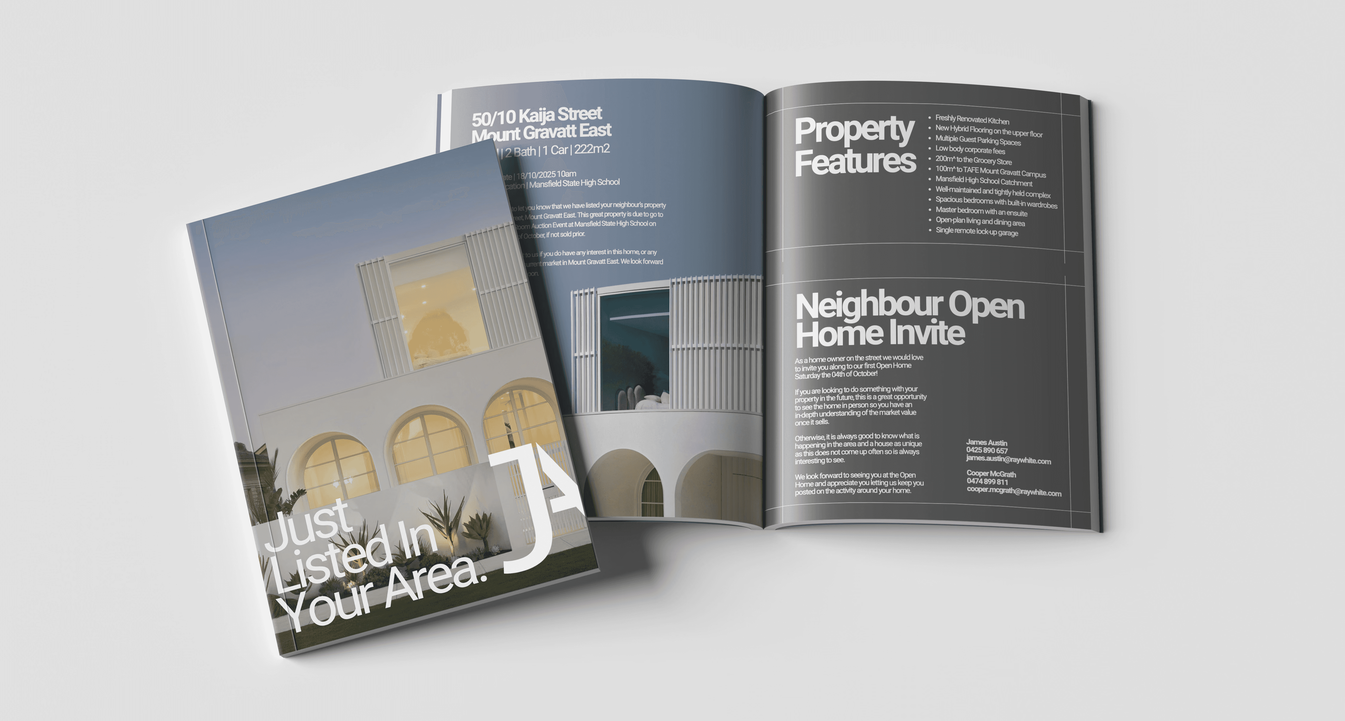
Designed for every touchpoint.
Property marketing requires a wide range of collateral, often with very different amounts of imagery, information and messaging. The refreshed identity was designed to accommodate those changing requirements while maintaining a consistent visual language across every client interaction.
From property brochures and case studies to supporting marketing collateral, each piece used the same underlying approach to typography, colour and layout. This helped create continuity between individual campaigns while strengthening recognition of the James Austin brand over time.

Designed to communicate clearly.
Effective property marketing needs to balance strong imagery with detailed information. Editorial layouts and clear typographic hierarchy were used to make property details easy to navigate without compromising the premium feel of the brand.
Content was structured to guide the reader naturally through each piece, giving photography room to lead while ensuring important property information remained accessible. This approach created collateral that felt considered and visually engaging while still performing its primary role as a communication tool.
A stronger foundation for the brand.
The completed refresh brought the James Austin Team’s marketing materials together under one cohesive visual identity. Rather than individual pieces feeling disconnected, the new system created a recognisable relationship between property campaigns, printed collateral and broader brand communications.
The result is a flexible identity that can support the team’s ongoing marketing while maintaining a polished and consistent presence. By establishing clear visual principles rather than designing each asset in isolation, the brand now has a stronger foundation that can continue to evolve alongside the business.